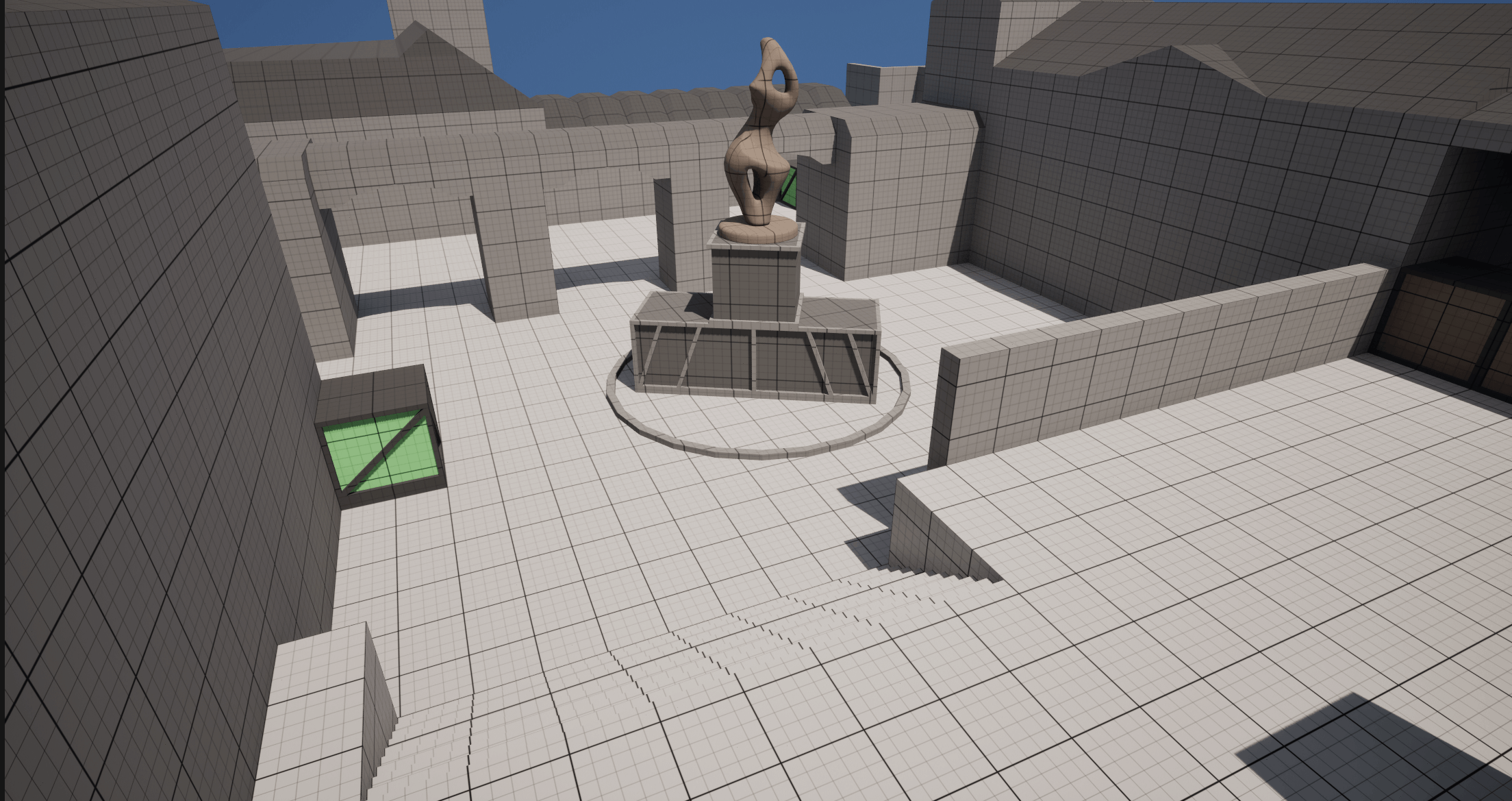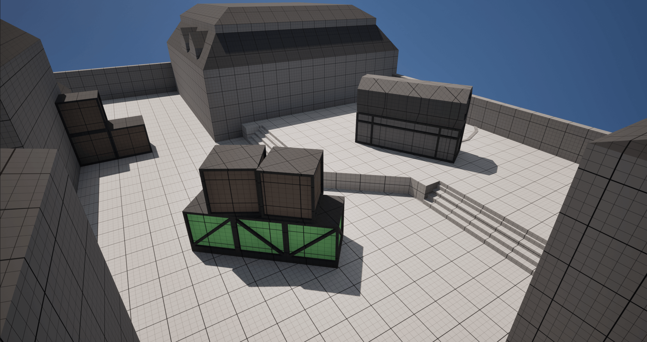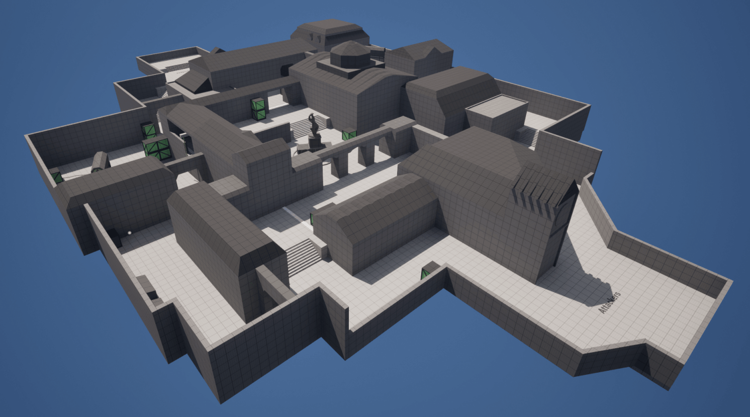
Design Intentions :
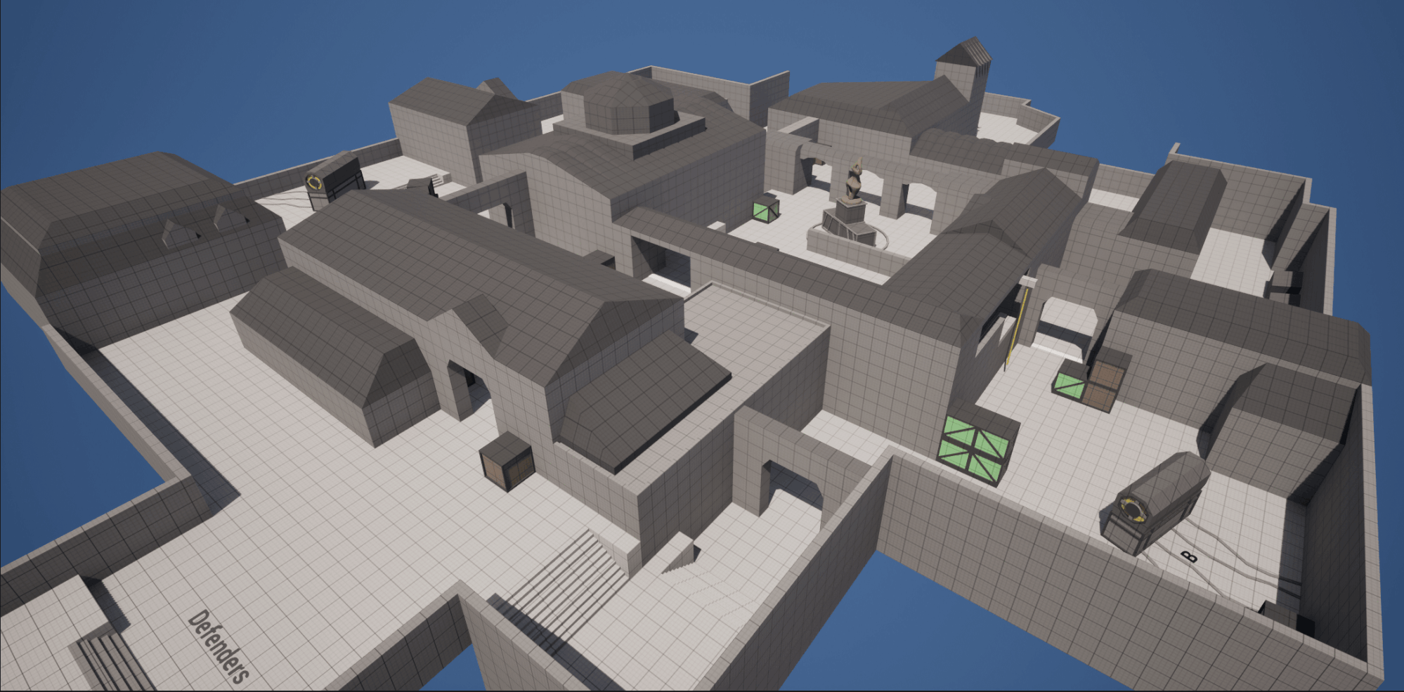
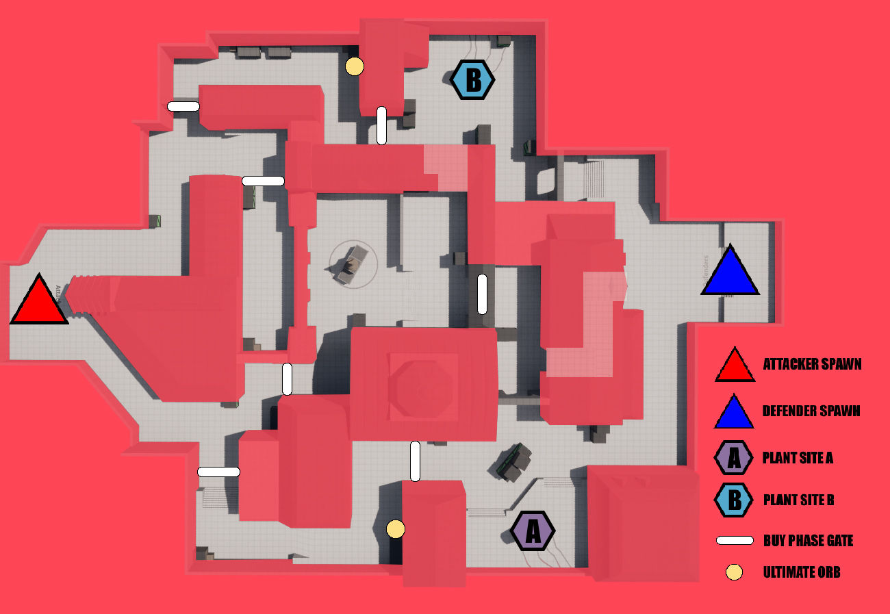
-Keep it simple, have a very clear and clean layout easy to navigate and to understand.
-Have multiple paths to objectives
-Follow the Valorant metrics and the key elements placements.
-Block the most important line of sight areas, while keeping it open enough for player abilities.
Challenges/weaknesses :
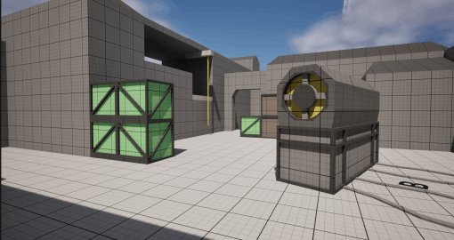
-As a Counter Strike player, I had to take a step back and not follow the CS metrics. For instance, after having it testing by a Valorant player I was asked to remove a lot of covers.
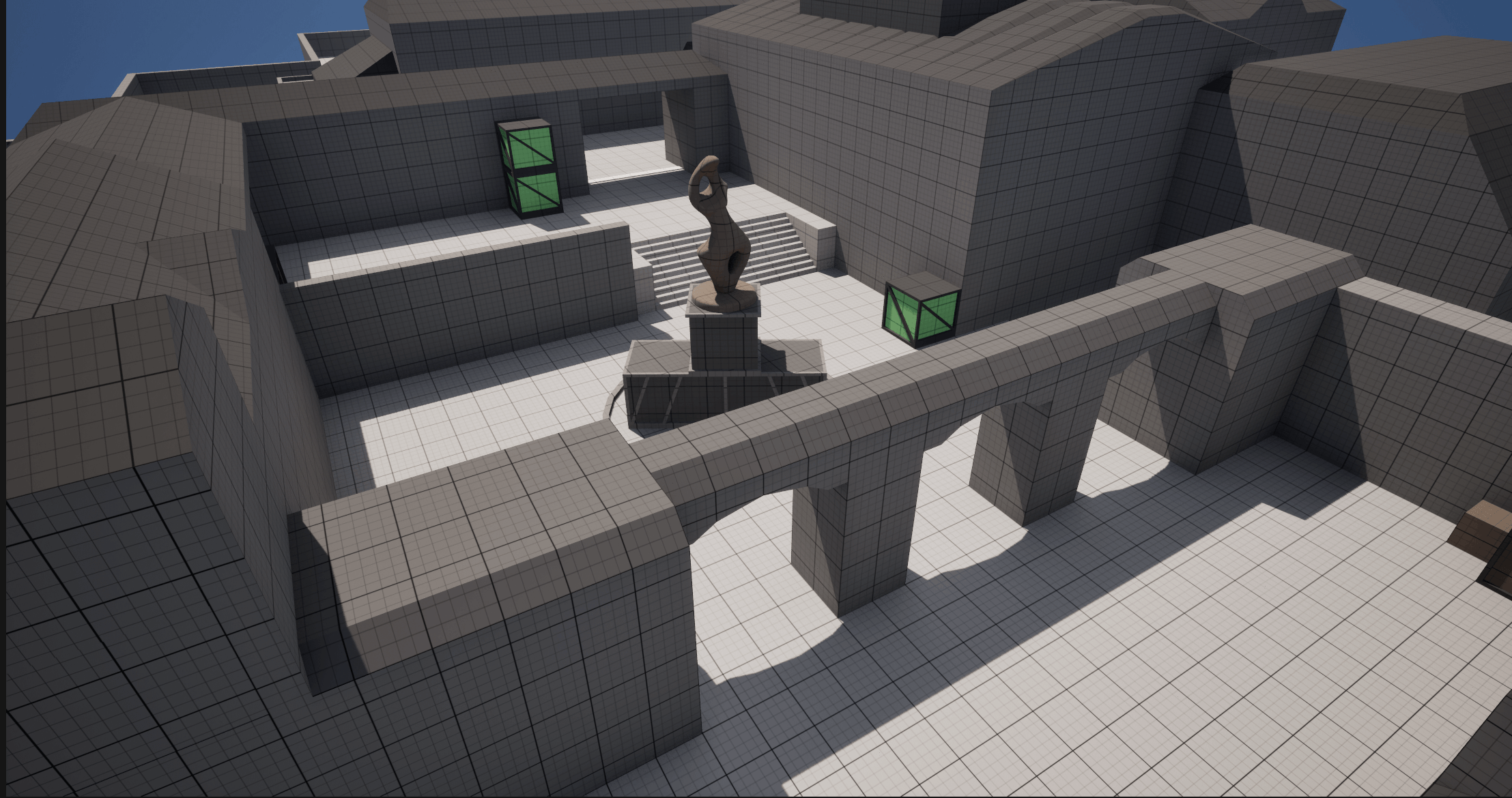
-The map's theme is weak. I focused on the function and not enough on the form.
-The map is not organic and chaotic enough. It's very "rectangular" and clean.
